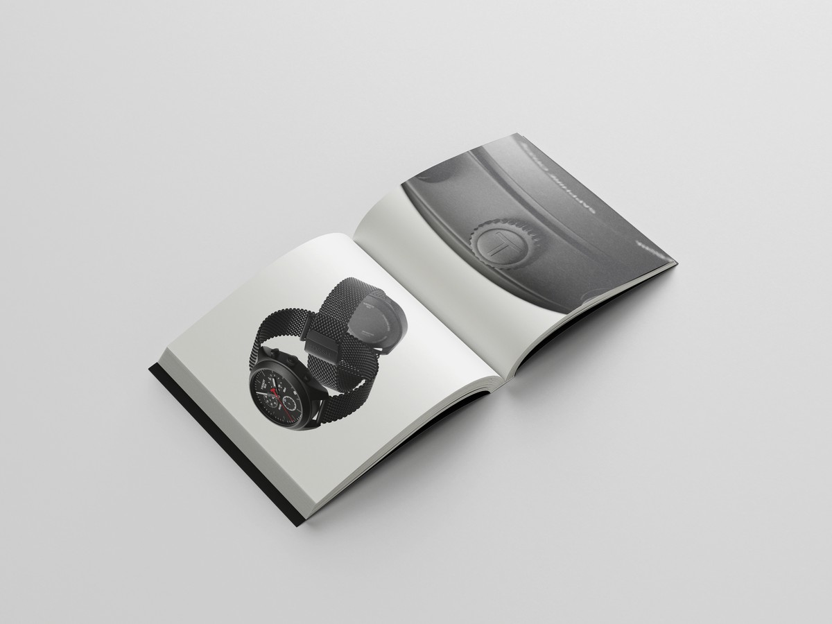
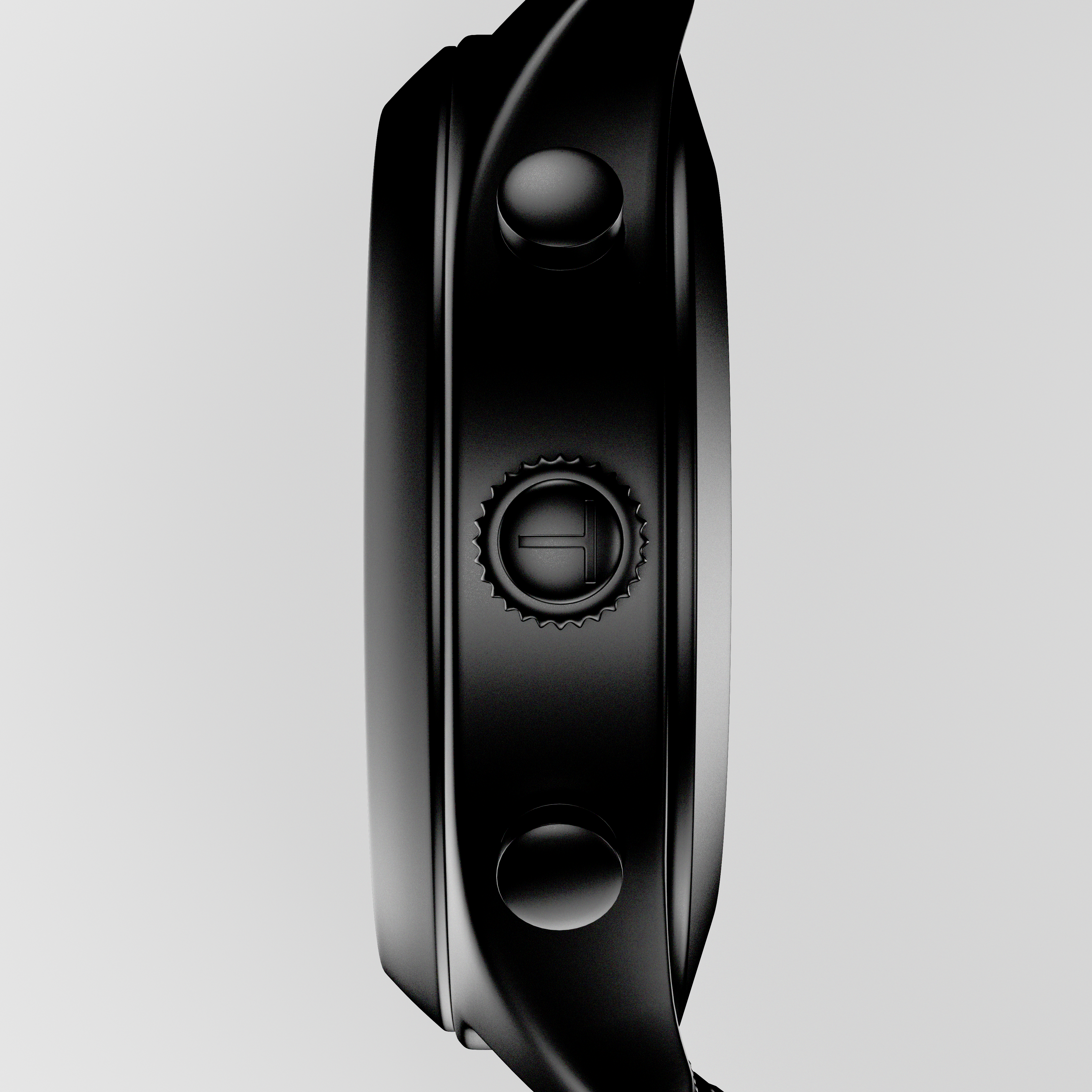
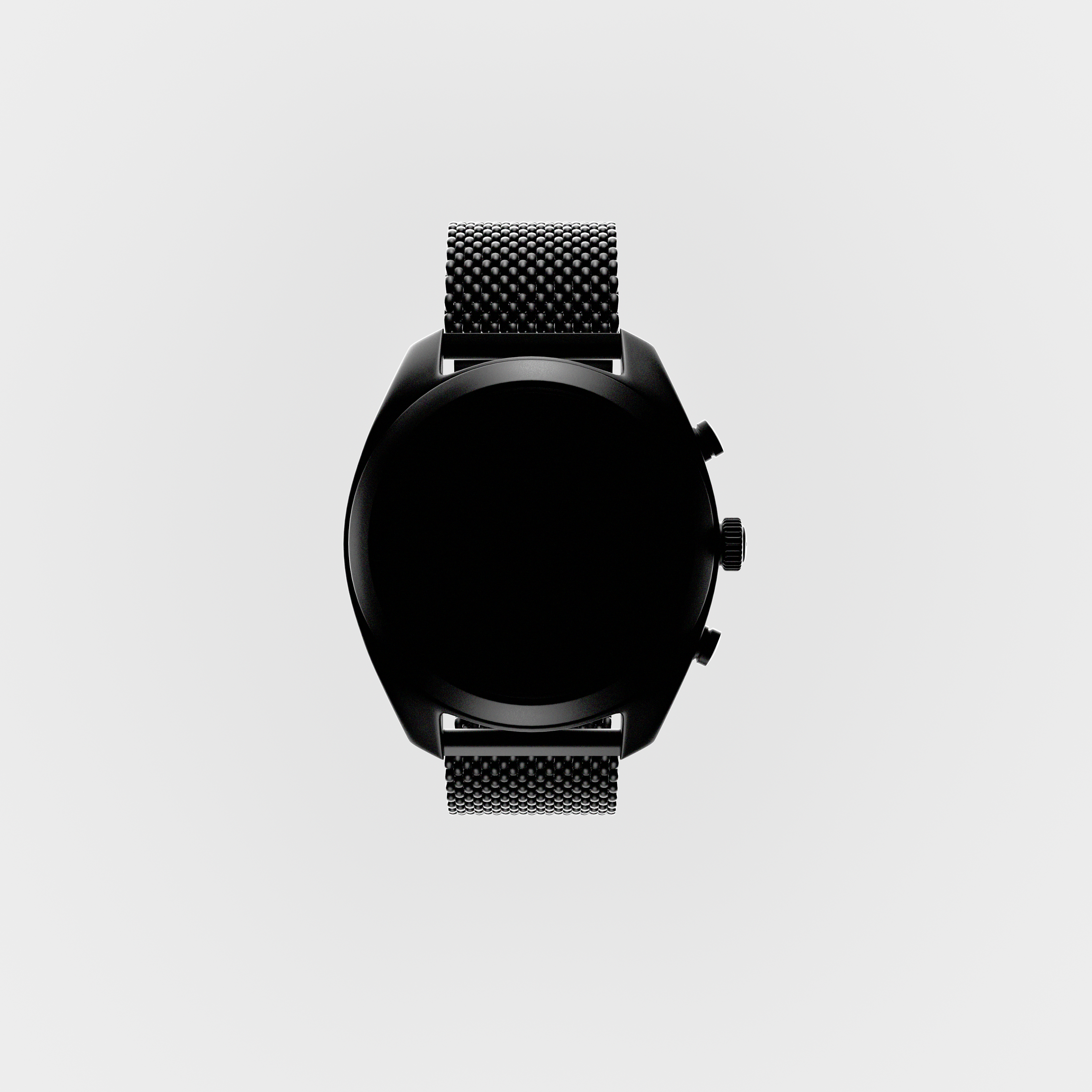
Tissot watch. Visual identity.
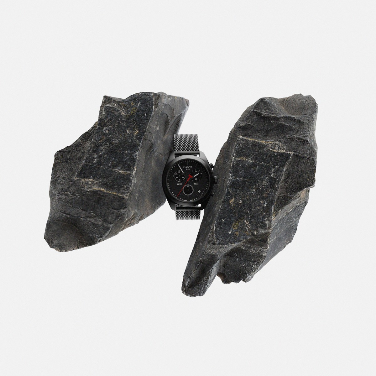
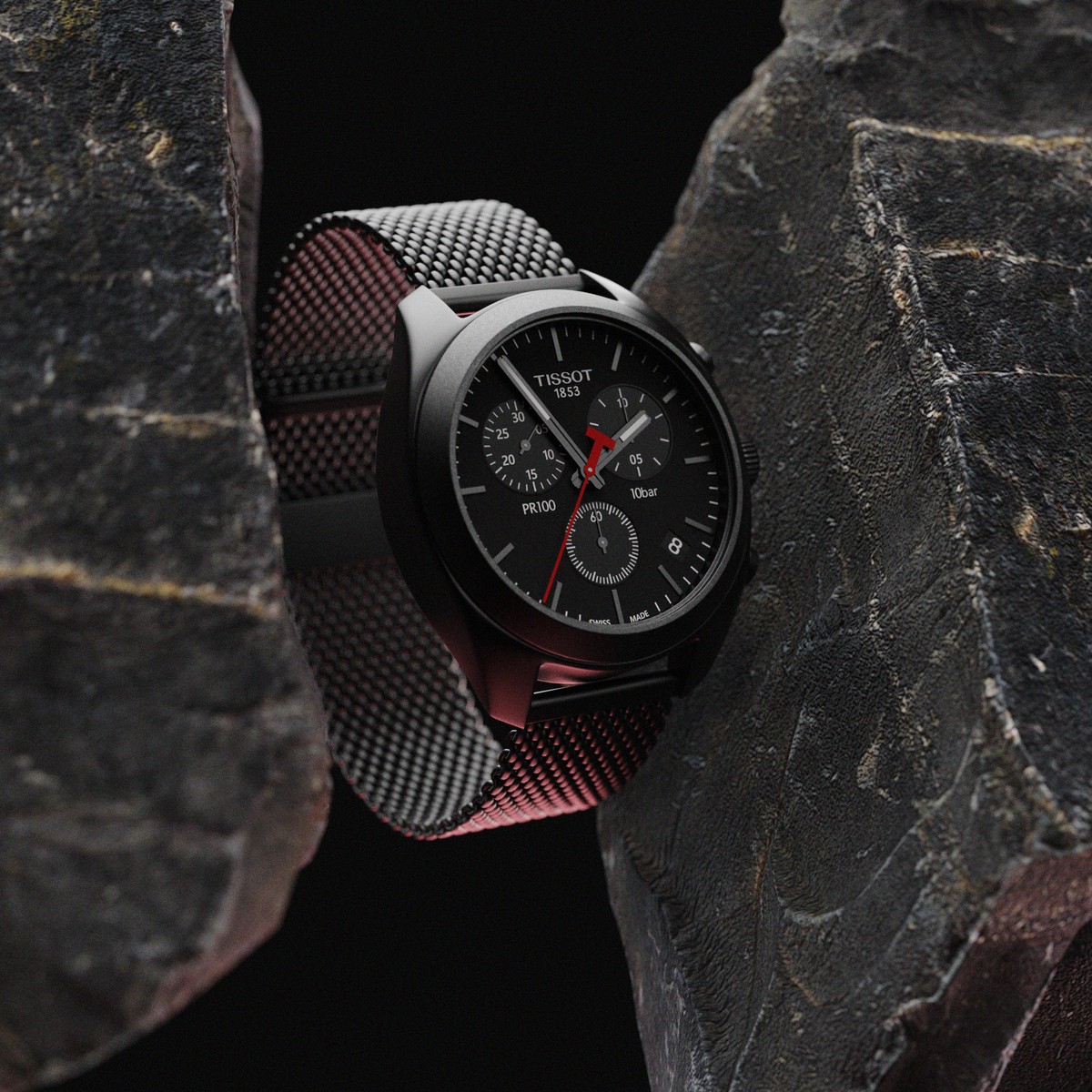
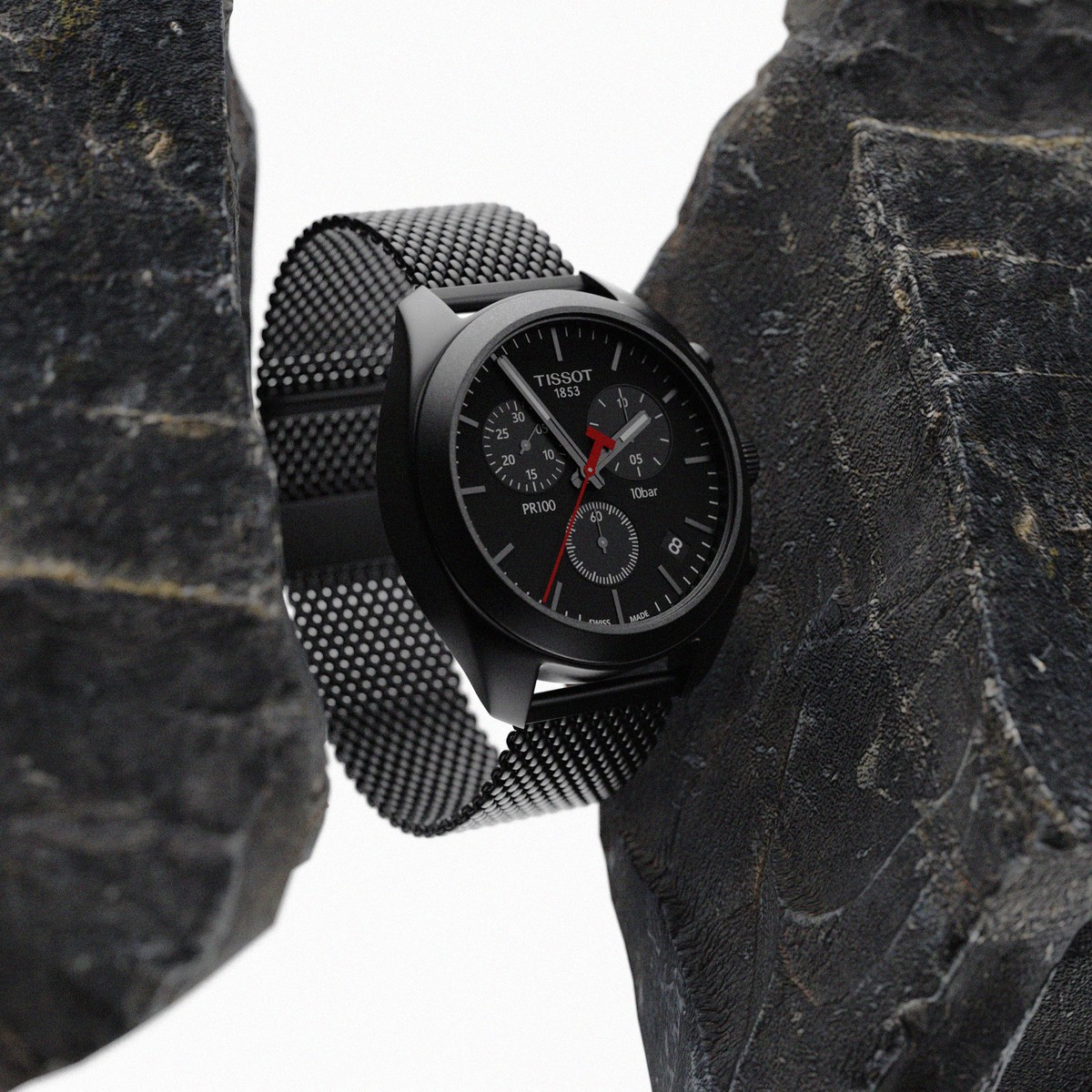
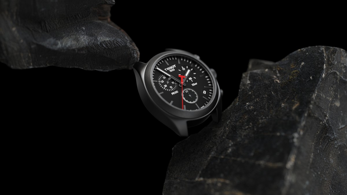
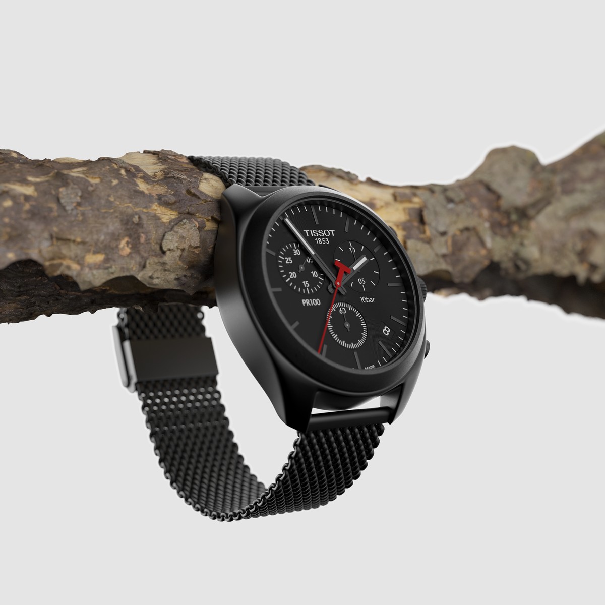
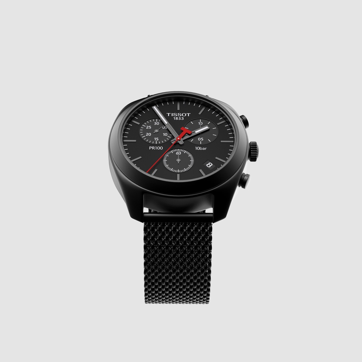
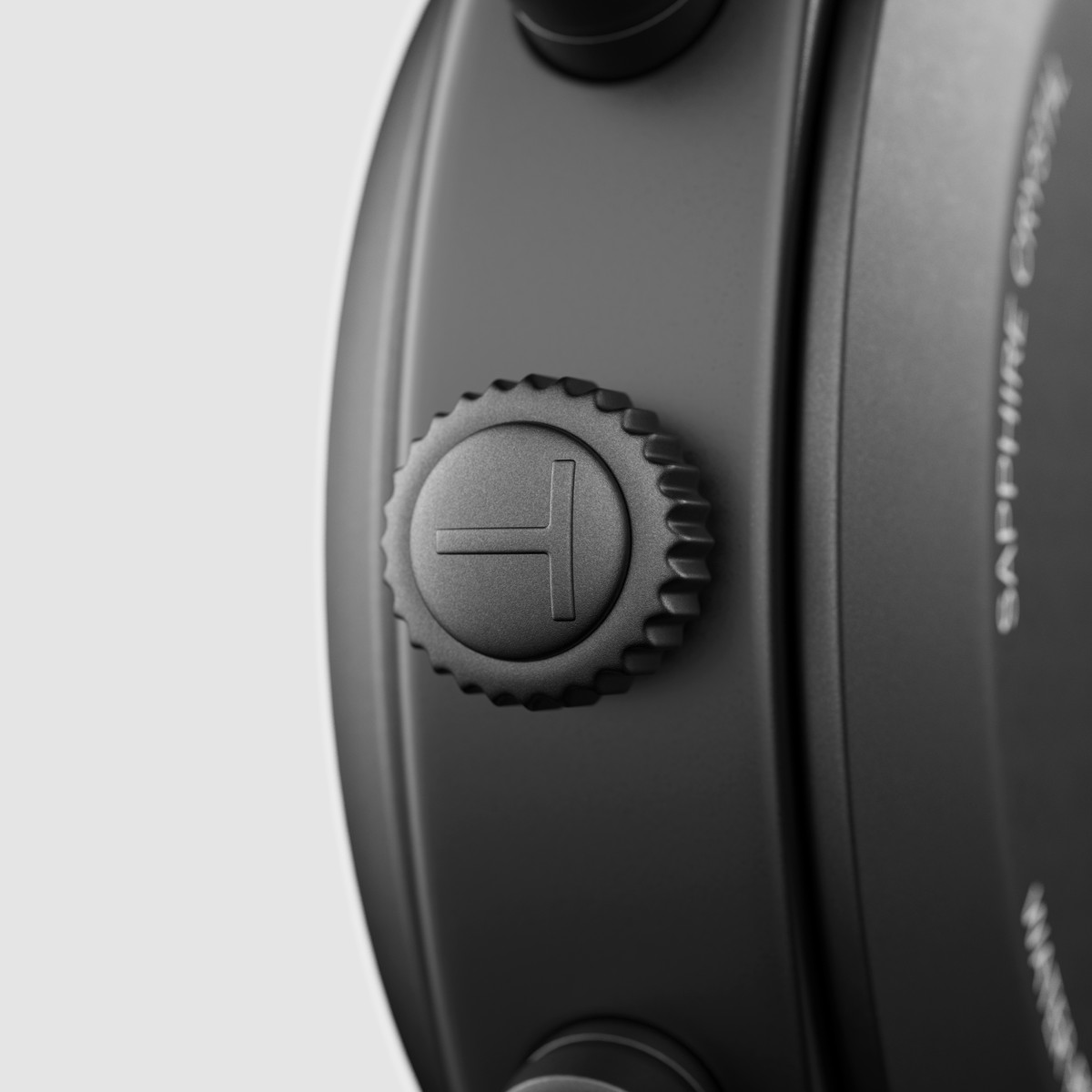
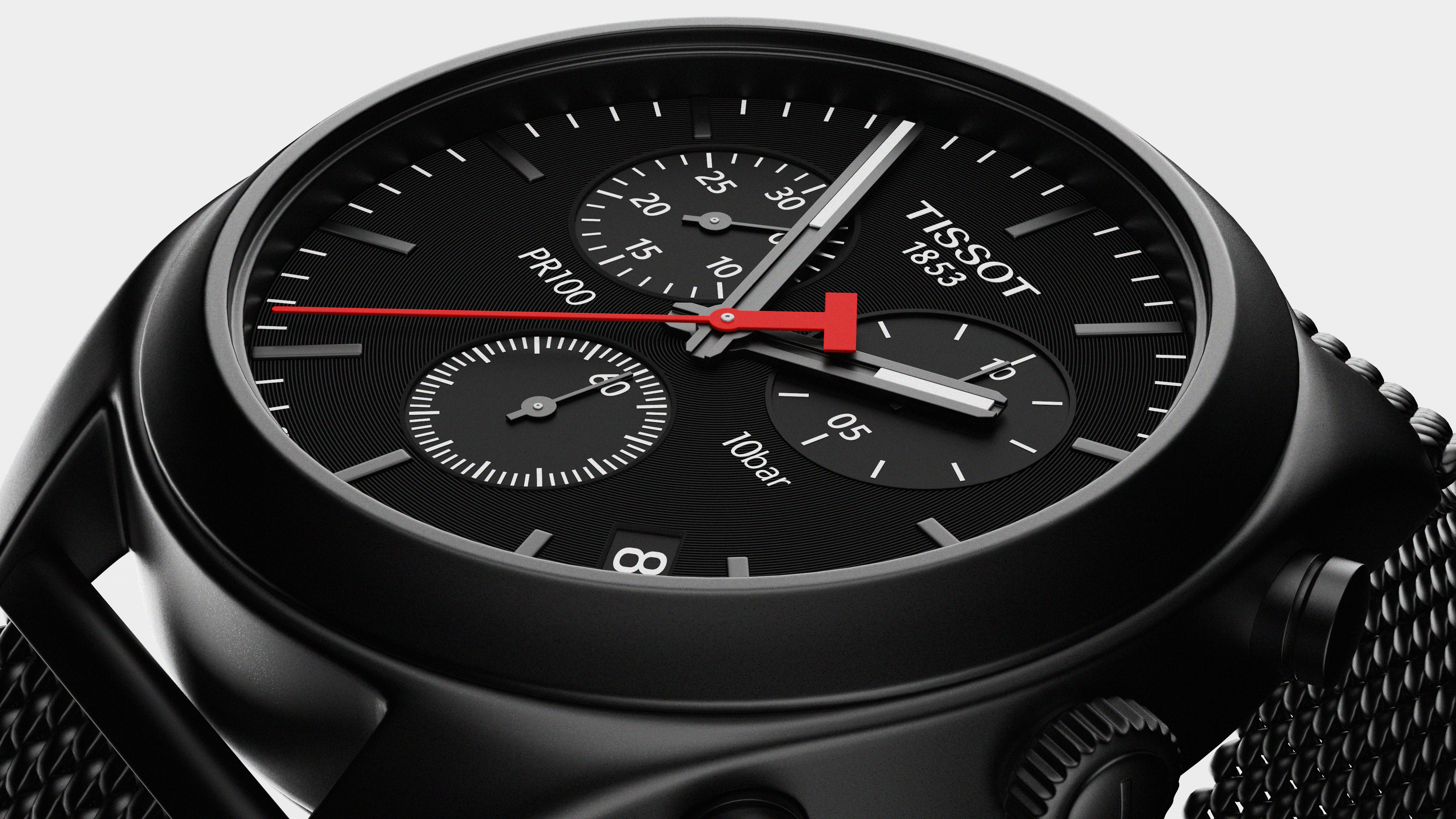
This work wants to show a visual experience looking at the design of the watch by placing it in context with untreated elements of nature and giving the product a focus on quality and finish.
A visual experience in movement
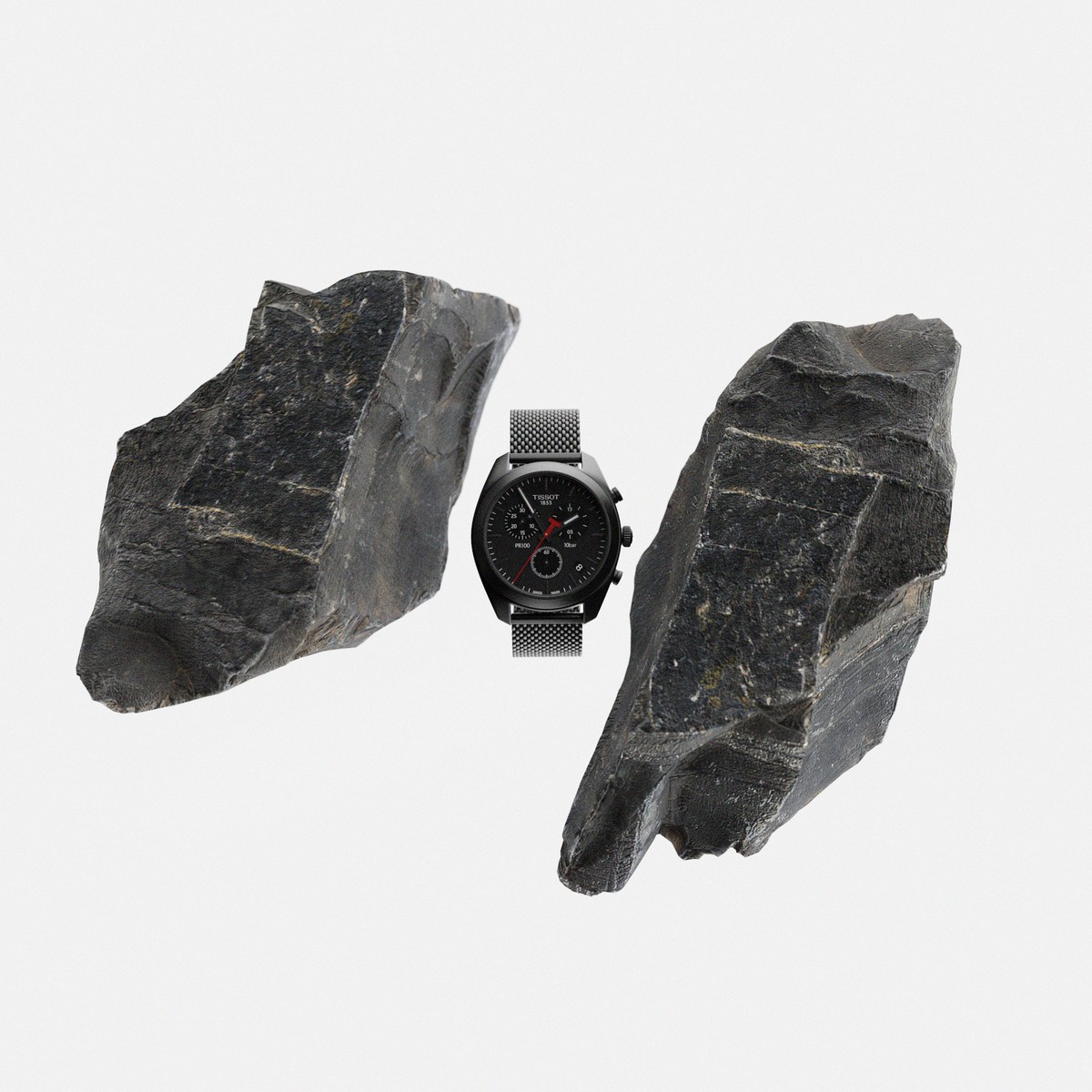
Comparing the perfect finishing of the watch compared to the sharp edges of the rocks. The effect of the distance of the stones is intended to show a movement that orbits over the watch, always reserving the protagonism to the product.
Hardness as rocks
The main idea wants to show the perfect finishes of the watch compared to the irregularities in rocks. It intends to give a focus, showing a red light on the watch as well as the hands typical of the watch brand.
Storytelling of the visual scene
The main inspiration for the visualization of this watch, was to present a product in a way that is inspiring and attractive, as well as giving a focus to the origin of every product as it is what nature provides. Beyond the product, it is about achieving a visual experience.
